As we begin 2017, let’s take a moment and look at the upcoming design trends you need to be aware of this year. 2016’s design trends are still popular, but there are a few new ones making their way into the forefront of designer’s minds. There are a few different types of design, so we will be looking at a few trends of each of the most common types of design.
Print Design Trends
MODERN- RETRO

Modern-retro has been around for a long time and will continue to grow in popularity. This trend is made up of retro typefaces and colors, mixed with a modern flare.
MINIMALISM

Minimalism focuses on simplicity and functionality of the concept your company is portraying. White space is a necessity when it comes to minimalism and gives the design more breathability. It is often the simplest designs that catch your eye.
BOLD PHOTOGRAPHY & SLEEK TEXT

This is a huge staple in the world of graphic design at the moment. The mix of bold and sleek text, with images that captivate the viewer. This trend exudes class and style. The text and photography work together to create great contrasts and brilliant borders.
Logo Design Trends
BROKEN LETTERS

Designers have been pushing broken letterforms in logo design recently. This adds opposition to the positive and negative space.
LINE ART

This trend uses a steady thickness of lines with only one solid color integrated. Designers are finding creative ways to utilize negative spacing into their line art designs.
HAND-DRAWN

Hand-drawn designs feel fresh, comforting, human and grounded. This trend takes time and talent, but is worth the effort! They really add a touch of personality & authenticity to a brand.
Web Design Trends
MOBILE FIRST!

This cannot be said enough. When it comes to the web, always plan what your design will look like on a mobile screen first and then grow from there! 80% of people prefer to search the internet on their mobile device. Make sure your web items are easy to see and designed for smaller, mobile screens.
MORE ORIGINALITY IN DESIGN, LESS STOCK ITEMS
Now that photography and stock video is so easily accessible, brands need to step away from using stock imagery, videos and icons. They are being over used so much, that you have to think outside of the box. In order to stand out and grab the audience’s attention, you need to have visuals that are unique to your brand.
Authentic Photography & Illustrations

This means finding stunning, natural images or hiring out a photographer and videographer. They can take shots around your practice, office or city. Sevenhills Wholefoods does a great job of having beautiful, full-screen, authentic imagery to draw users in and assist with their brand message and story-telling.
Big, Bold, Beautiful Typography

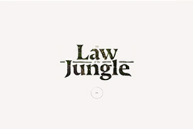
Typography is a powerful tool that can create personality, evoke emotion and set tone. Over-sized, full screen type that breaks the grid, really adds hierarchy and uniqueness to a design, especially on the web.
Video has become King

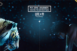
A moving image on a page instantly captures the users attention. This draws your audience in, so your brand can get across their message in a more captivating way.
INTERACTIVITY

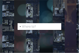
Adding interactivity to your site can help add new, interesting elements that keep your audience’s attention longer. Interactivity also helps to visually convey your message. Though, it is important to make sure you don’t over do the interactivity. Even though it is fun to have, if you have too much going on your audience may feel overwhelmed and leave your site.
Trends are a great way to stand out, but make sure they fit in with your brand message before applying them. As popular as some trends may be, using them could leave your audience confused. If you want more design tips, check out our helpful design blogs here!
