Category

Web Design

5 Tips for Creating a Highly Effective Landing Page

By | Consulting, Marketing, Web Design | No Comments

A landing page is a web page that is distinct from your main website with a focused objective. Typically, they exist to measure click-through rates and lead generation. Knowing this, what exactly makes a landing page help you effectively reach your goals?
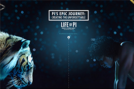
1. Grabs Attention

When a user lands on your page you want to make sure your message is clear. Users that are browsing the web are pressed to make snap decisions to see if you are worth their attention. On average you will get less than 8 seconds. If that visitor finds what they can get on your site quickly, they are more likely to stick around a bit longer to see what you are about.

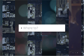
2. Clear Call to Action

Creating a good call to action is a great and simple way to improve conversion rates. You should focus on one call to action on each page. Your messaging should be in a prominent location and easy to understand. The call to action is one of the most important parts of your landing page, so make sure this is a focused priority when building your page.

3. Simple Communication

What is a visitor thinking when they land on your page? Most likely they will be wondering what is the page for and will it provide what they are looking for. You want to answer these questions right away so they will continue to read and browse on. A simple message of what your brand is about can help, but also the positioning of the content is important. According to studies, most people follow a “F shaped” pattern when reading web content. You can use that as a guide to simply and effectively communicate your message to the visitor, so they don’t have to browse your page to the point of frustration.

4. Testimonials

Have you been mentioned in the press or do you have high-end customers? You should showcase this on your landing pages. Adding excellent testimonials or reviews is a great way to show that you are well-known for your services. This gives the visitors a chance to understand what products or services you are offering in a way that relates to them & helps develop their trust in your brand.

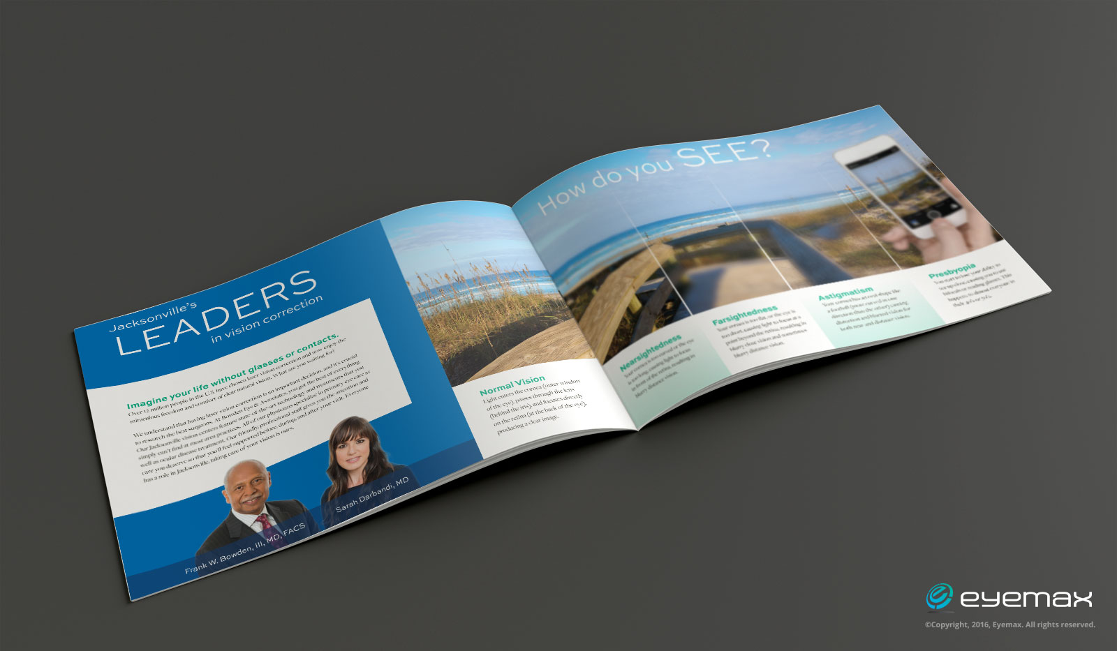
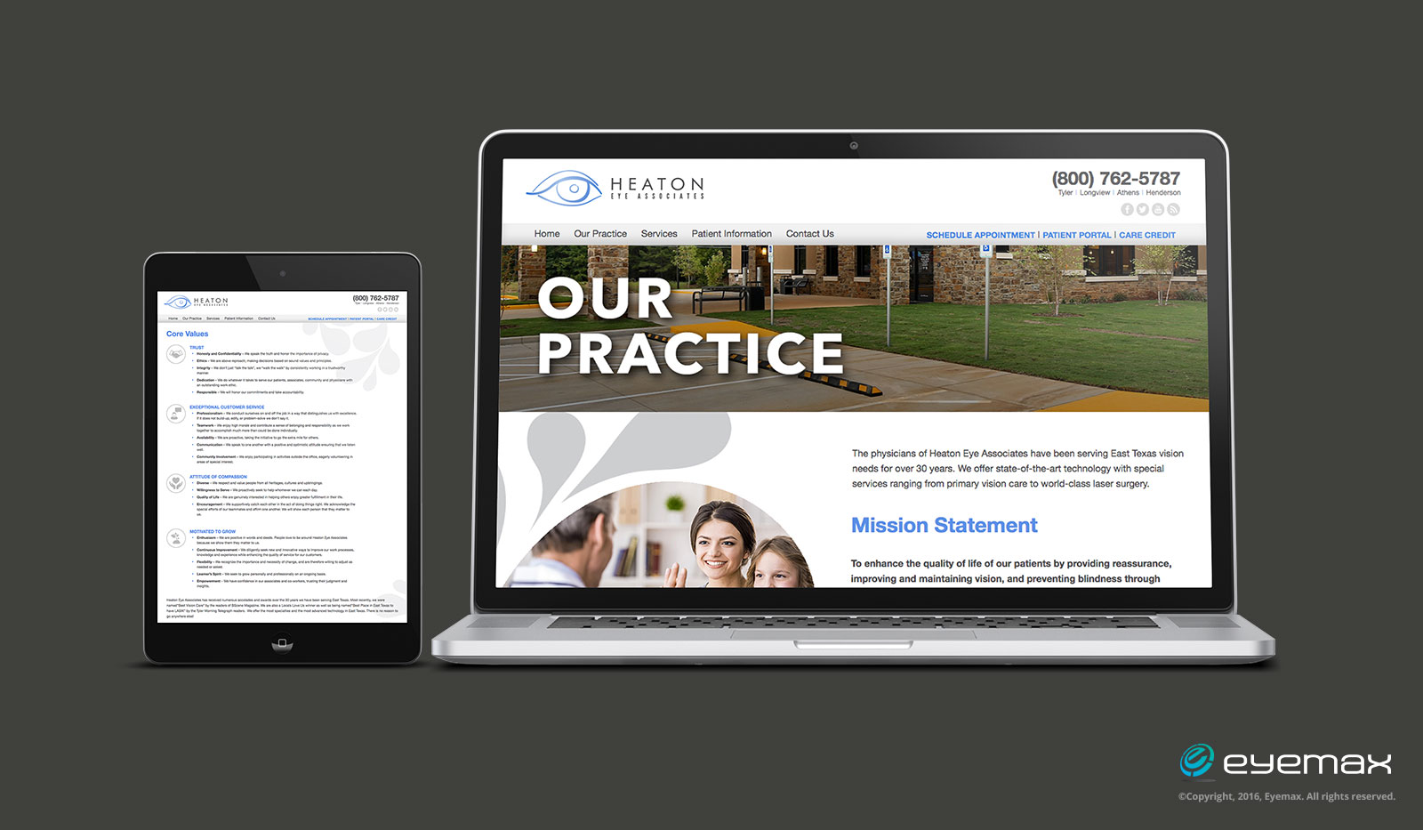
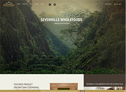
5. A Great Looking Landing Page

Design is a very important part of a landing page. It helps people correctly judge the credibility of your web site. If it looks professional, you must be professional. If you use more pleasing, modern graphics the visitors get the impression of a higher quality site. Do not overload your site so that your site becomes too busy. It might seem to sloppy, unprofessional and scare away potential clients.

White Space is NOT Wasted Space

By | Graphic Design, Marketing, Web Design | No Comments

Unless you have been living under a rock, you have most likely heard the term “white space.” In design terms, white space also refers to negative space, or the absence of content. Essentially we see it as the space between photos, text and other elements. Although, many consider white space to be wasted real estate, it is important to remember that it should be regarded as an active design element. Integrating white space in design creates the feeling of sophistication, allows for clear content prioritization, and is essential for a visually appealing layout.

White Space in a nutshell: 


1. It creates the feeling of sophistication.

A generous amount of whitespace can contribute to a high-end brand position. For example: In this brochure the practice’s brand message is clear and engaging. The use of a large amount of white space created with color, images and minimal content makes this practice look more high-end.

EMWTSpaceExample1


2. It puts focus on the content.

A cluttered layout is unattractive and doesn’t make viewers want to read the content. Studies have shown that white space actually improves reading comprehension. For example: This practice’s website uses white space to improve readability so that the content is clear.

EMWTSpaceExample2


3. It provides balance.

White space supports the visual integrity of a layout because it helps to prioritize content. It will actually guide your eyes from one point to another around a page or website. For example: This advertorial print ad does a nice job of using white space to guide the reader through the content.

EMWTSpaceExample3

We understand, first hand, that it’s often tempting to fill up every inch of space in a brochure, on a business card, or a website. Clients have a lot to say about their practice and services. But quite frankly, cluttering up printed layouts or websites won’t make your marketing efforts more effective. It could communicate a message about your practice that is not positive.

Consider keeping your layouts or websites focused on key elements (i.e. content and photos) and leave plenty of white space to allow for sophistication, clear legibility with focus on your content, and a balance that will guide your viewers effortlessly.

*Mock-Up newspaper was provided by zippypixels.com

Online Shopping Habits

Online Shopping Habits

By | Consulting, Marketing, Web Design | No Comments

As smartphones and tablets have become more readily available, more consumers are preferring to buy products online using those devices. As a result the need for a more mobile friendly and responsive eCommerce websites is on the rise. Below are a few insights on the habits of online shoppers.

About one-third of consumers are open to transitioning from a physical wallet to a virtual one.

Your online reviews are very much influencing the way people buy products online. 71% of consumers believe that online reviews are essential to the buying process. So don’t neglect to ask for and monitor your reviews.

About 60% of consumers buy online at least once a month, and 24% shop online at least weekly.

39% of online buyers who use a smartphone prefer using an app, but 61% choose to use a web browser.

40% of consumers in the United States say they would buy any sort of product online. That really broadens the online market.

Around 59% of shoppers say that they would purchase more often if the website of a particular store loaded faster, and 43% of consumers said they would buy often if the site was secure.

If a website didn’t offer ease of use and was too complicated, 58% of buyers said they wouldn’t bother purchasing from that particular online store, with 57% saying the same thing if the mobile screen was too small.

2017 Design Trends

By | Graphic Design, Marketing, Web Design | No Comments

As we begin 2017, let’s take a moment and look at the upcoming design trends you need to be aware of this year. 2016’s design trends are still popular, but there are a few new ones making their way into the forefront of designer’s minds. There are a few different types of design, so we will be looking at a few trends of each of the most common types of design.

Print Design Trends

MODERN- RETRO
modern-retro

Modern-retro has been around for a long time and will continue to grow in popularity. This trend is made up of retro typefaces and colors, mixed with a modern flare.

MINIMALISM
minimalism

Minimalism focuses on simplicity and functionality of the concept your company is portraying. White space is a necessity when it comes to minimalism and gives the design more breathability. It is often the simplest designs that catch your eye.

BOLD PHOTOGRAPHY & SLEEK TEXT
boldphotography

This is a huge staple in the world of graphic design at the moment. The mix of bold and sleek text, with images that captivate the viewer. This trend exudes class and style. The text and photography work together to create great contrasts and brilliant borders.

Logo Design Trends

BROKEN LETTERS
broken

Designers have been pushing broken letterforms in logo design recently. This adds opposition to the positive and negative space.

LINE ART
line

This trend uses a steady thickness of lines with only one solid color integrated. Designers are finding creative ways to utilize negative spacing into their line art designs.

HAND-DRAWN
handdrawn

Hand-drawn designs feel fresh, comforting, human and grounded. This trend takes time and talent, but is worth the effort! They really add a touch of personality & authenticity to a brand.

Web Design Trends

MOBILE FIRST!
mobilefirst

This cannot be said enough. When it comes to the web, always plan what your design will look like on a mobile screen first and then grow from there! 80% of people prefer to search the internet on their mobile device. Make sure your web items are easy to see and designed for smaller, mobile screens.

MORE ORIGINALITY IN DESIGN, LESS STOCK ITEMS

Now that photography and stock video is so easily accessible, brands need to step away from using stock imagery, videos and icons. They are being over used so much, that you have to think outside of the box. In order to stand out and grab the audience’s attention, you need to have visuals that are unique to your brand.

Authentic Photography & Illustrations
boldimages

This means finding stunning, natural images or hiring out a photographer and videographer. They can take shots around your practice, office or city. Sevenhills Wholefoods does a great job of having beautiful, full-screen, authentic imagery to draw users in and assist with their brand message and story-telling.

Big, Bold, Beautiful Typography
typeography

Typography is a powerful tool that can create personality, evoke emotion and set tone. Over-sized, full screen type that  breaks the grid, really adds hierarchy and uniqueness to a design, especially on the web.

Video has become King
video

A moving image on a page instantly captures the users attention. This draws your audience in, so your brand can get across their message in a more captivating way.

INTERACTIVITY
interactivty

Adding interactivity to your site can help add new, interesting elements that keep your audience’s attention longer. Interactivity also helps to visually convey your message. Though, it is important to make sure you don’t over do the interactivity. Even though it is fun to have, if you have too much going on your audience may feel overwhelmed and leave your site.

Trends are a great way to stand out, but make sure they fit in with your brand message before applying them. As popular as some trends may be, using them could leave your audience confused. If you want more design tips, check out our helpful design blogs here!

4 Mobile Marketing Stats you Need to Know

4 Mobile Marketing Stats You Need To Know

By | Marketing, Web Design | No Comments

If you are interested in keeping up with consumer impact on mobile marketing (which you should be), then check out these important stats. Keep them in mind as you develop your digital strategy for 2017!

1.  The time users spend on mobile media is up over 51% compared to 42% desktop use.

This stat should help you consider switching your focus on how to better reach your audience. If you don’t have a mobile strategy or your website optimized for mobile, you are missing out on big opportunities.

2.  Over 36% of mobile subscribers use mobile devices to view email.

Take the time to make sure your emails look as professional as possible and can be viewed correctly on mobile devices. If they aren’t easy to view and read, you could run into some trouble with over one-third of your subscribers.

3.  Over 50% of smartphone users start their day by using their smartphone.

Find ways to insure that you are keeping your target audience engaged with your business. Send out emails at specific times and use subject lines that are time appropriate, such as “Good Morning”.

4.  88% of consumers will visit or call a local business with in 24 hours if they searched for it on a mobile device.

First impressions always count! The majority of people use their mobile devices then they are ready to make a purchase or need a specific service. Be sure that your mobile site stands out and makes a positive impact on your users.

For more tip & statistics, follow us on Twitter, LinkedIn, Facebook & Pinterest!