All Posts By

design

Three Things You Should Know About Generation Z

By | Consulting, Graphic Design, Marketing | No Comments

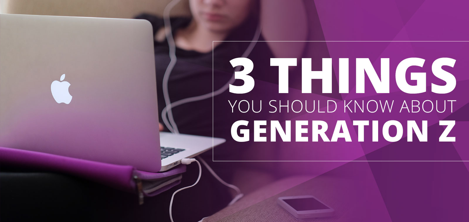
Generation Z is quickly rising in financial, cultural and social power in the U.S. and more and more companies are starting to shift their marketing to gear towards this new generation. By 2020, 40% of all consumers will be Generation Z. This generation represents 23 million Americans (ages 13-24) with a combined buying power of $43 billion and an additional influence on family spending to a tune of $600 billion.

If you focus on the following three things you need to know about Generation Z you will better understand and effectively target this major group of new LASIK patients.

  1. Where to find Gen Z.
    This demographic of LASIK patients was born into a digitally dominated world. An alarming 72% of Gen Z display symptoms of emotional distress when they are separated from their electronic devices. Most of them are actively connected within only an hour of waking up in the morning. The most common sites you can find them on are Twitter, Instagram, Snapchat, SoundCloud, Spotify, Musical.ly, Triller, We Heart It, and Tumblr.
  2. Gen Z are more cautious than Millennials.
    If we really think about it Gen Z have grown up witnessing Millennials lose their jobs, move back in with their parents and not be able to own a home or even their own car. This explains why Gen Z is more focused on building a plan for success. They are realistic, practical and more focused than their older siblings.
  3. Video rules their lives.
    Gen Z now turns to how-to videos on YouTube, instead of reading tutorials. This platform simplifies articles, is more engaging and more in-depth. In fact, 93% of Gen Z visits YouTube at least once a week and 33% of them watch lessons online.

Gen Z is still young and a little contradictory. They will go to extremes to stage the perfect selfie or Snapchat, and yet demand brands to be authentic. They want the most exclusive products… however they look for them to be broadly available. Just remember, Gen Z is still young and very impressionable. Beginning to understand them now will set your practice up to successfully target this new generation of LASIK patients.


White Space is NOT Wasted Space

By | Graphic Design, Marketing, Web Design | No Comments

Unless you have been living under a rock, you have most likely heard the term “white space.” In design terms, white space also refers to negative space, or the absence of content. Essentially we see it as the space between photos, text and other elements. Although, many consider white space to be wasted real estate, it is important to remember that it should be regarded as an active design element. Integrating white space in design creates the feeling of sophistication, allows for clear content prioritization, and is essential for a visually appealing layout.

White Space in a nutshell: 


1. It creates the feeling of sophistication.

A generous amount of whitespace can contribute to a high-end brand position. For example: In this brochure the practice’s brand message is clear and engaging. The use of a large amount of white space created with color, images and minimal content makes this practice look more high-end.

EMWTSpaceExample1


2. It puts focus on the content.

A cluttered layout is unattractive and doesn’t make viewers want to read the content. Studies have shown that white space actually improves reading comprehension. For example: This practice’s website uses white space to improve readability so that the content is clear.

EMWTSpaceExample2


3. It provides balance.

White space supports the visual integrity of a layout because it helps to prioritize content. It will actually guide your eyes from one point to another around a page or website. For example: This advertorial print ad does a nice job of using white space to guide the reader through the content.

EMWTSpaceExample3

We understand, first hand, that it’s often tempting to fill up every inch of space in a brochure, on a business card, or a website. Clients have a lot to say about their practice and services. But quite frankly, cluttering up printed layouts or websites won’t make your marketing efforts more effective. It could communicate a message about your practice that is not positive.

Consider keeping your layouts or websites focused on key elements (i.e. content and photos) and leave plenty of white space to allow for sophistication, clear legibility with focus on your content, and a balance that will guide your viewers effortlessly.

*Mock-Up newspaper was provided by zippypixels.com

Print Techniques

Not All Printing Is The Same

By | Graphic Design | No Comments

Understanding Your Options

There are a wide variety of printing options available. Most printing techniques were developed for very specific applications. The main printing processes we frequently use are Offset, Digital and Screen printing.

Offset Printing is the most common printing process today. It offsets ink from metal plates to a rubber blanket and onto the paper. Almost all commercial printers do offset printing. This method is the most dependable for superior image quality. You receive the most value, as it is the least expensive technique for creating top quality work in large volumes.

Digital Printing is the newest printing process. This method includes Inkjet (use of print heads that spray ink) or xerography (uses electrical charges that attract toner particles) to create prints. Digital printing is best for short-run and fast turnaround work. With this method you are very limited in color, paper choices and quality. However, due to its rising popularity, this technology is fast rising.

Screen Printing is also known as silk-screening. Ink is transferred onto a substrate following a stencil pattern. One shade of ink is printed at a time. Several screens are used to create multicolored graphics. This method is best suited for clothing, stickers and billboards.

Finishing Touches

There are also some really amazing finishing techniques available that can add more visual interest to printed work. We most commonly use Embossing, Varnish, Die Cuts and Foils.

PrintFinishesVarnish is a liquid coating applied to a printed surface to add a clear glossy, matte, satin, or neutral finish.
Embossing
creates a raised impression on a surface.
Die Cuts involve cutting of shapes in paper or paperboard using a die.
Foils are affixed to a certain material by a heating process.

Choosing the Right Printing Techniques

It’s very important that both printing supplier and consumer know the answer to these 6 questions in order to choose the proper method for any given project:

  1. How many print copies are needed?
  2. When is the deadline?
  3. What must be printed and why?
  4. What additional finishes must be completed after the printing?
  5. Which printing tools are available?
  6. Which method can meet the project’s budget?

So when you’re looking for a printer, make sure you know that they can deliver what you need. Printing is a complicated process. The more you ask, the better your printed results will be!

3 Design Trends for 2016

By | Graphic Design, Marketing | No Comments

Why are design trends important to a practice?
We are sure you don’t want to look and feel outdated. People will make a lot of assumptions based on the impression they get from the design of your website, brochure, or even your television commercial. It’s important for a practice to stand out visually, and staying ahead or on top of trends will allow them to do so.

Eyemax pays close attention to the ever-changing trends of design, on and offline. We’d like to share with you what we believe will be the most prominent trends of graphic design in 2016.

Google Flat Design1. Flat Design
With many brands adopting flat design in the last few years, patients are more aware that less is more when it comes to design. This trend uses simple illustration, clean typography and a lot of white or negative space.

Google is a perfect example. They have redesigned and modernized not only their logo but also their overall identity towards simplistic, flat design. This has allowed them to adapt to a multi-device driven society.

Eyemax Infographic2. Infographics
Infographics have been a major trend in many marketing channels: social media, SEO, content marketing and even print. An infographic can easily present an overwhelming amount of information to your patients in an easy to understand diagram.

Everyone enjoys a well-designed infographic, and above all we love the results… infographics are shared 3 times more than any other piece of visual content.

3. Professional Photography
Many practices are moving away from overused stock photography and making the investment to hire professionals to create custom made imagery.

The overuse of stock images can become unoriginal to include in our branding efforts for a practice. With following this trend, we advise a healthy mix of both for our clients. Custom made imagery is a way for a practice to stand out visually, and be remembered. Stock imagery can be beneficial in visual storytelling with supporting an overall brand message.

As always keep in mind – a picture is worth a thousand words.