Unless you have been living under a rock, you have most likely heard the term “white space.” In design terms, white space also refers to negative space, or the absence of content. Essentially we see it as the space between photos, text and other elements. Although, many consider white space to be wasted real estate, it is important to remember that it should be regarded as an active design element. Integrating white space in design creates the feeling of sophistication, allows for clear content prioritization, and is essential for a visually appealing layout.
White Space in a nutshell:
1. It creates the feeling of sophistication.
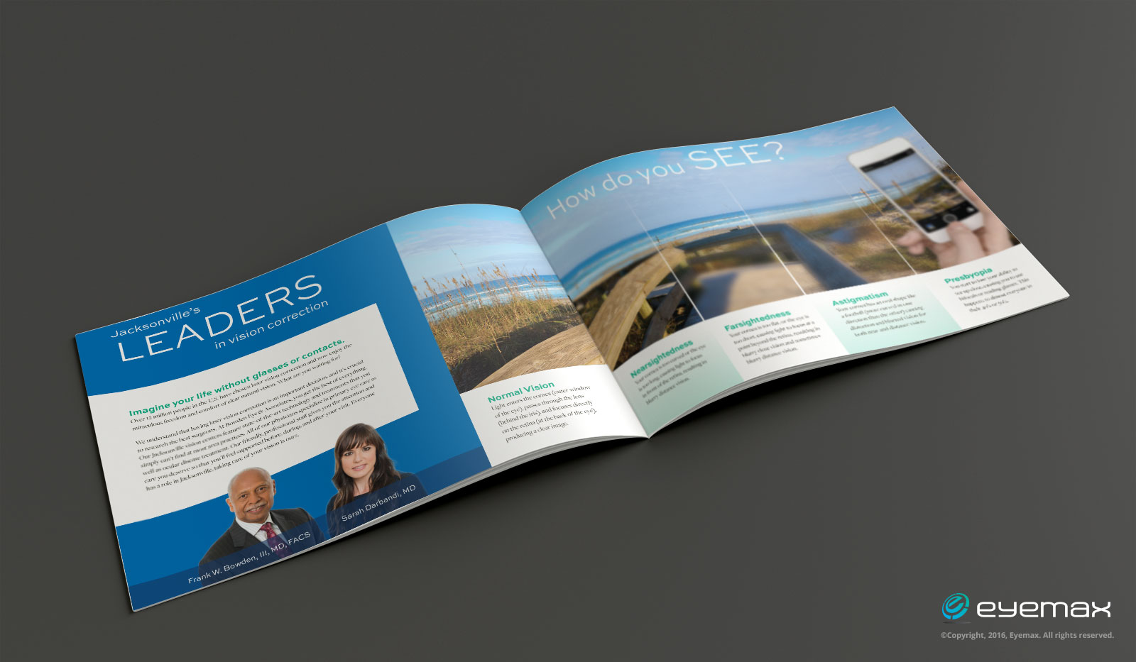
A generous amount of whitespace can contribute to a high-end brand position. For example: In this brochure the practice’s brand message is clear and engaging. The use of a large amount of white space created with color, images and minimal content makes this practice look more high-end.
2. It puts focus on the content.
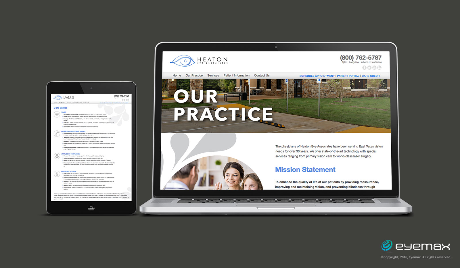
A cluttered layout is unattractive and doesn’t make viewers want to read the content. Studies have shown that white space actually improves reading comprehension. For example: This practice’s website uses white space to improve readability so that the content is clear.
3. It provides balance.
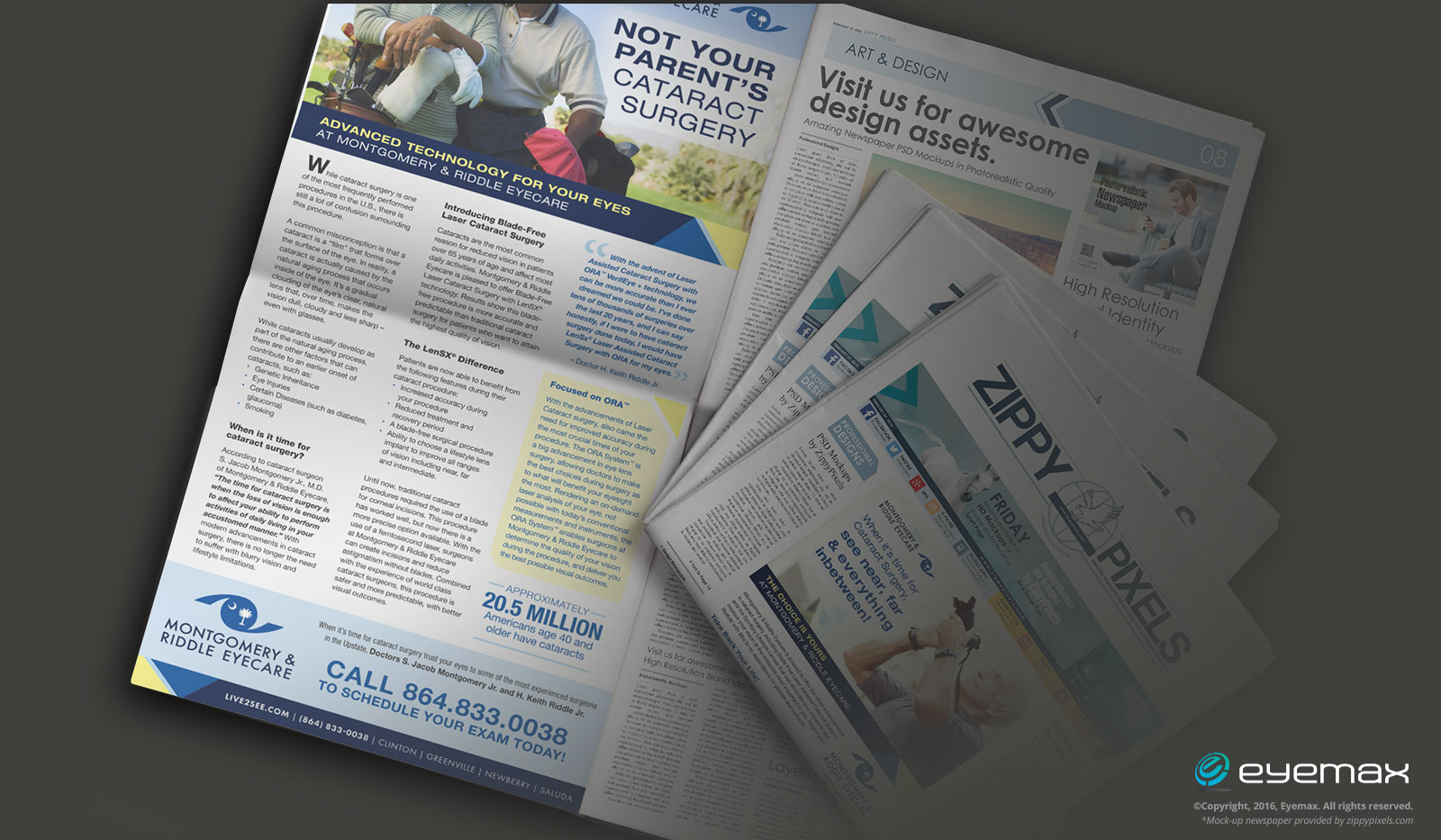
White space supports the visual integrity of a layout because it helps to prioritize content. It will actually guide your eyes from one point to another around a page or website. For example: This advertorial print ad does a nice job of using white space to guide the reader through the content.
We understand, first hand, that it’s often tempting to fill up every inch of space in a brochure, on a business card, or a website. Clients have a lot to say about their practice and services. But quite frankly, cluttering up printed layouts or websites won’t make your marketing efforts more effective. It could communicate a message about your practice that is not positive.
Consider keeping your layouts or websites focused on key elements (i.e. content and photos) and leave plenty of white space to allow for sophistication, clear legibility with focus on your content, and a balance that will guide your viewers effortlessly.
*Mock-Up newspaper was provided by zippypixels.com


