All Posts By

social

How to Reach Millenials & Generation Z on Social Media

How to Reach Millennials & Generation Z on Social Media

By | Consulting, Marketing, Social Media | No Comments

Just when we thought we were starting to understand millennials, there’s a new kid in town. Name: Generation Z or Gen Z. As Baby Boomers & Gen Xers get older and retire, Millennials & Gen Z will be major spenders in the economy. Gen Z shares several similarities with Millennials, but there are also major key differences.

Millennials

Born: 1982-2002 Current Population: 74.5 million

Millennials are the first generation adapted to new technologies, growing up in the age of internet. The internet has shaped several characteristics of this generation. Millennials were given a platform to connect to each other, speak their minds & educate themselves to determine their own opinions.

Key Traits

– Brand loyal
– Avid consumers
– Comfortable voicing opinions
– Like attention & praise
– Immune to traditional marketing
– Less trusting of others than older generations
– More accepting & tolerant than older generations
– Care about social change & charity
– Optimistic about the future
– Connect by social media (the selfie generation)
– Attached to multiple devices (smartphones, laptops, tablets)
– Seen as over-sharers on social media by older generations
– Outnumber Baby Boomers in population
– Have overtaken Gen X in the workforce

Generation Z

Born: 1996-2010 Current Population: 23 million & growing

Gen Z is the most connected and tech savvy generation yet. They are sophisticated, mature and more aware than most generations. Part of what makes Gen Z unique, is that they have grown up being exposed to global events as they happen. They have always had instant access to technology, social media and online videos. They use social media and YouTube for research, as opposed to starting with a search engine like Google. By 2020 Gen Z will account for 40% of all consumers.

Key Traits

– Technology geniuses (more so than Millennials)
– Prefer mobile technology, have always had mobile options
– Impatient to slow websites/apps, long videos & response times
– Choose digital conversations over real life
– Mature, sophisticated & confident
– More independent than older generations
– Don’t like conformity or traditional ways
– Aware of global events, seen from an early age
– More accepting and inclusive than older generations
– Entrepreneurial, prefer to own a business
– Optimistic about personal future
– Need a sense of purpose in work & to give back
– Focused on long-term global issues
– Selective about what they share on social media
– Brand loyal, often influenced by recommendations from friends & family

MUST HAVE TECH for Millennials & Gen Z:

Mobile Friendly Websites
Your site HAS to be mobile friendly & it needs to look good. 57% of users say they won’t recommend a business with a poorly designed mobile site. Millennials & Gen Z are tech savvy & don’t have time for slow loading, desktop websites.

Apps Are a Must
When you provide an app, your brand is right there on their phone all the time. This gives your audience easy access to your products or services. The easier it is to access, the more likely Millenials & Gen Z are to stick around & explore what you have to offer. Apps account for 89% of mobile media time of ALL users.

Social Media Presence
Millennials and Gen Z expect all brands to have a social media presence. They often check Facebook first, before they go to Google to research your brand. Millennials & Gen Z use Youtube to research products or services, get answers to questions and find recommendations. Don’t make them work to find you, put your brand on as many social platforms as you can manage. Social media will help develop trust in your brand, showing that you are authentic with nothing to hide. If you don’t have the most basic social media accounts, these generations will pass by your brand.

6 Ways to Reach Millennials & Gen Z with Social Media

1. Facebook Live something that makes your business unique. Do you work with lasers? Do you take care of cute puppies all day? Gen Z & Millennials don’t want to see you in a perfect scripted video. They want an inside look & to see the real people behind the screen. This can be anything from showcasing your personality to presenting new technologies. If you trust your audience with an exclusive look, they will start to build trust & brand loyalty.

2. Update your Instagram Story. Millennials & Gen Z want short, bite sized information. The Instagram stories feature gives you the chance to create short videos, photos and Boomerang gifs. This allows you to really showcase how your brand is unique. There are 6 million active users on Instagram, reach out to them in a creative & interesting way.

3. Offer experiences, not a sales pitch. Millennials & Gen Z are not going to buy what you’re selling if you market the old fashioned way. They want to spend their income on something that will last a lifetime. What can your product or service do to benefit your audience in the long run? Show Millennials & Gen Z how you can change their life & what experiences are possible in the future.

4. Let them talk about it. Millennials & Gen Z use social media to find out more about a business & to share their own experiences. Make sure you are offering them a place to connect with you. Your brand should be easy to find on all social platforms. Stay on top of reviews & mentions, making sure to respond in a timely & sincere manner. Connect the audience to your brand by assigning a hashtag that matches your company story & start the conversation with them. Most importantly of all LISTEN.

5. Put them in the spotlight. Millennials & Gen Z often share photos & videos on social media. This includes showcasing the products & services they love. They assign themselves the role of brand advocate & pass on positive word-of-mouth messages. Use the awesome free content they are providing & re-share with your entire audience. These generations love to feel appreciated and valued. They develop brand loyalty when their creativity is embraced & recognized.

6. Keep your web/social clean & modern. Millennials & Gen Z are accepting, tolerant and multicultural. They don’t want to see traditional stock photography in your ads. Show that you think outside of the box, using modern photography that showcases lifestyle & experiences. Communicate visually to diverse audiences. You are selling them the experience, so showcase the entire story in your social media graphics.

If you want to learn more about Eyemax, come see us at ASCRS/ASOA Symposium & Congress. Meet our experts & learn how to increase your conversions & surgery volume.

Online Shopping Habits

Online Shopping Habits

By | Consulting, Marketing, Web Design | No Comments

As smartphones and tablets have become more readily available, more consumers are preferring to buy products online using those devices. As a result the need for a more mobile friendly and responsive eCommerce websites is on the rise. Below are a few insights on the habits of online shoppers.

About one-third of consumers are open to transitioning from a physical wallet to a virtual one.

Your online reviews are very much influencing the way people buy products online. 71% of consumers believe that online reviews are essential to the buying process. So don’t neglect to ask for and monitor your reviews.

About 60% of consumers buy online at least once a month, and 24% shop online at least weekly.

39% of online buyers who use a smartphone prefer using an app, but 61% choose to use a web browser.

40% of consumers in the United States say they would buy any sort of product online. That really broadens the online market.

Around 59% of shoppers say that they would purchase more often if the website of a particular store loaded faster, and 43% of consumers said they would buy often if the site was secure.

If a website didn’t offer ease of use and was too complicated, 58% of buyers said they wouldn’t bother purchasing from that particular online store, with 57% saying the same thing if the mobile screen was too small.

2017 Design Trends

By | Graphic Design, Marketing, Web Design | No Comments

As we begin 2017, let’s take a moment and look at the upcoming design trends you need to be aware of this year. 2016’s design trends are still popular, but there are a few new ones making their way into the forefront of designer’s minds. There are a few different types of design, so we will be looking at a few trends of each of the most common types of design.

Print Design Trends

MODERN- RETRO
modern-retro

Modern-retro has been around for a long time and will continue to grow in popularity. This trend is made up of retro typefaces and colors, mixed with a modern flare.

MINIMALISM
minimalism

Minimalism focuses on simplicity and functionality of the concept your company is portraying. White space is a necessity when it comes to minimalism and gives the design more breathability. It is often the simplest designs that catch your eye.

BOLD PHOTOGRAPHY & SLEEK TEXT
boldphotography

This is a huge staple in the world of graphic design at the moment. The mix of bold and sleek text, with images that captivate the viewer. This trend exudes class and style. The text and photography work together to create great contrasts and brilliant borders.

Logo Design Trends

BROKEN LETTERS
broken

Designers have been pushing broken letterforms in logo design recently. This adds opposition to the positive and negative space.

LINE ART
line

This trend uses a steady thickness of lines with only one solid color integrated. Designers are finding creative ways to utilize negative spacing into their line art designs.

HAND-DRAWN
handdrawn

Hand-drawn designs feel fresh, comforting, human and grounded. This trend takes time and talent, but is worth the effort! They really add a touch of personality & authenticity to a brand.

Web Design Trends

MOBILE FIRST!
mobilefirst

This cannot be said enough. When it comes to the web, always plan what your design will look like on a mobile screen first and then grow from there! 80% of people prefer to search the internet on their mobile device. Make sure your web items are easy to see and designed for smaller, mobile screens.

MORE ORIGINALITY IN DESIGN, LESS STOCK ITEMS

Now that photography and stock video is so easily accessible, brands need to step away from using stock imagery, videos and icons. They are being over used so much, that you have to think outside of the box. In order to stand out and grab the audience’s attention, you need to have visuals that are unique to your brand.

Authentic Photography & Illustrations
boldimages

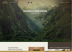
This means finding stunning, natural images or hiring out a photographer and videographer. They can take shots around your practice, office or city. Sevenhills Wholefoods does a great job of having beautiful, full-screen, authentic imagery to draw users in and assist with their brand message and story-telling.

Big, Bold, Beautiful Typography
typeography

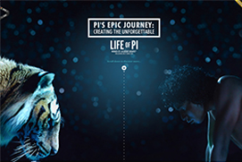
Typography is a powerful tool that can create personality, evoke emotion and set tone. Over-sized, full screen type that  breaks the grid, really adds hierarchy and uniqueness to a design, especially on the web.

Video has become King
video

A moving image on a page instantly captures the users attention. This draws your audience in, so your brand can get across their message in a more captivating way.

INTERACTIVITY
interactivty

Adding interactivity to your site can help add new, interesting elements that keep your audience’s attention longer. Interactivity also helps to visually convey your message. Though, it is important to make sure you don’t over do the interactivity. Even though it is fun to have, if you have too much going on your audience may feel overwhelmed and leave your site.

Trends are a great way to stand out, but make sure they fit in with your brand message before applying them. As popular as some trends may be, using them could leave your audience confused. If you want more design tips, check out our helpful design blogs here!

6 Tips to Manage Online Reviews like a Pro

6 Tips to Manage Online Reviews like a Pro

By | Consulting, Social Media | No Comments

Not sure how to interact with your customers or patients online? Interacting with your followers is a huge part of building an online presence and managing your online reputation. As scary as it may be, you should be actively requesting reviews and feedback for your products or services. Even if you have positive reviews from the past, reviews should be current & coming in weekly. New statistics show that:

  • 73% of consumers think that reviews older than 3 months aren’t relevant.
  • 22% of consumers will only consider reviews written in the last 2 weeks.

With this in mind, how you respond to your reviews is key to building a positive relationship with your followers. If you need a little help, here are 6 tips to manage online reviews like a pro.

Have a Quick Response Time

Replying quickly shows that you are attentive to your patient’s or customer’s needs and are interested in hearing their feedback. It also shows that if there is a problem, you are quick to respond and fix any issues or concerns. If you don’t have a social media manager, make sure that there is an employee who checks your review sites daily.

Show Authentic Appreciation

Show appreciation to your followers, for simply taking the time to share their personal experience with your service. Acknowledge that you know how busy they are and that it is a BIG deal that they took this time out for feedback. Express this gratitude in an authentic way by responding to each review with a unique and thoughtful reply.

Reiterate their Concerns

Reiterate a phrase from the online review. This shows that you have carefully read their post and thoughtfully responded to their individual needs. Show concern for the reviewer’s well-being and hit the topics that mean something to them. Restate and reinforce the positive changes the service or product has made in the reviewer’s life or what needs improvement.

The Customer is Always Right

Always be polite and professional when interacting with your customers online, just as you would in person. This is an opportunity to practice great consumer relations, so leave your emotions at home when you are crafting responses.

Use all reviews as a tool to learn more about your customer. Bad reviews show you what you need to work on. Good reviews highlight your strengths. Your review response gives you the perfect platform to survey the customer & ask what you can do better.

Use Keywords in Your Response

Research review websites & see what keywords are showing up the most often in your search. Find competitors in your field & monitor what words and phrases they are using.

Use Emojis 😀 🎈

92% of the online population is using emojis to express themselves, so why not jump on the bandwagon? Emojis are a straight forward way to bring a little fun into your review responses. Don’t be too cryptic with your emoji use, just use them to emphasize your appreciation ❤❤❤.

For more helpful tips, check out Steps for Handling a Difficult Patient & How to Respond to Negative Social Media Reviews.

How to Choose the Best Colors to Brand Your Practice

How to Choose the Best Colors to Brand Your Practice

By | Consulting, Graphic Design, Marketing | No Comments

Deciding on what colors will best represent your practice is an essential part of building your brand message! Color can evoke emotions and thoughts, so it is vital to keep this in mind when choosing the colors that represent your practice. The perception your patients have of your brand will be influenced by your color choices, so here are a few tips to help you decide what hues are best.

Understand the Psychology Behind Color

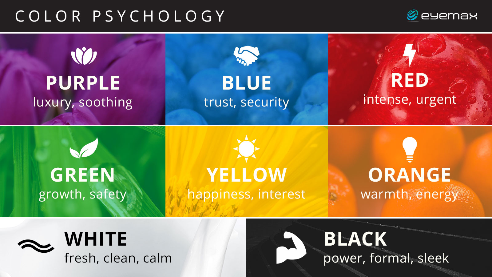
Color is a great tool to communicate with your patients. Depending on the shades you use to represent your practice, you can influence certain types of feelings your patients have towards your practice. For example, yellow and orange are perfect for evoking feelings of warmth, happiness and interest. And black will elevate your practice to appear luxurious.

Color Psychology

Browse Pinterest

Pinterest is a great tool for inspiration. Try searching color schemes, or color combinations. As you search through content, save pins with color that you are immediately drawn to. Sharing this idea board with your administrator or marketing team will allow them to see what types of hues you are drawn to and give them a great starting point when building your brand.

Look at Your Competitors

Another great method is looking at what colors your competitors use. When doing this, you will be able to stay original and get an idea of what color could help you stand out in the sea of your market.

Ask yourself, What do you like?

At the end of the day, it is important to choose the colors that you are drawn to. Essentially, your brand is a reflection of yourself. Stay original to who you are and don’t feel pressured to use certain colors, even if other practices in your market are using them. Using colors that express who you are will create a unique image for your practice.