
 Traditionally, brands follow a strict set of guidelines, especially when it comes to using a color palette. But with today’s competition the effort to be heard over all the buzz online and in stores has pushed companies to find bolder ways to get their brand to stand out from everything else. More and more companies are integrating multiple brand color schemes, and finding major success in response.
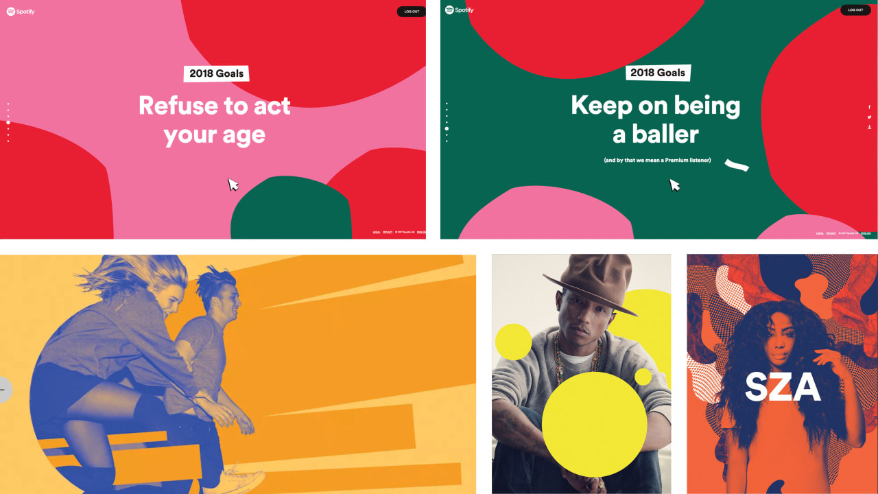
Spotify started adopting this change in branding a few years ago across all marketing efforts and brand standards. They found inspiration from diving into music history. In fact, designs from album covers from the 60’s influenced the duotone graphics they are so well known for today.

Ebay defined a new language for user experiences. They released the logo from its four-color treatment, designing a system where the logo could become a symbol of how diverse ebay is.

![]()
Spotify does a nice job of balancing color palettes when applying this trend. They don’t complicate it with endless color combinations and use this simplicity to allow their messaging to take the spotlight. Ebay has the best execution with this treand. Their guidelines supply a grid system and mood color palette options for a more modern twist. One thing these two companies do well with this trend is that they have created a diverse brand that has allowed their logos to become symbols, all while standing out in a vast sea of marketing efforts on digital platforms and more.
Is your brand getting lost in the sea of marketing in your area? Contact us today to find out how we can bring your brand into the digital age.

