Monthly Archives

March 2016

Your Google Ranking Matters

By | Marketing, Web Design | No Comments

Want to know the trick to getting your business out there and visible to the public? Most people think advertising or word of mouth is the most important factor. As a business owner, here is something you should consider: 89% to 93% of all buying decisions start online. When consumers want something they typically go to search engines, like Google, right from the start.

The goal is to make sure that your business is visible from the beginning, when someone searches for services you provide. Your Google Ranking determines how far down on the list of links your potential patients have to look, to find your business. You want to be as close to the top as possible, preferably on the first page of search results. First page websites get 91.5% of traffic through Google. Consumers usually won’t dig too deep, they will only check out the first view sites that came up from their search.

3 Tips to raise your Google ranking:

Your Page Title — Make sure that the title of your web pages, (which is the text in-between the <TITLE> tags in your web page’s code), have meaningful keywords that you would expect people to search for. For example if you provide LASIK services, you should have words like “LASIK” in your title i.e. “LASIK Eye Surgery”. Pretty simple stuff right? The more keywords in your title pertaining to your business, the more likely that Google will find your web page. Keep in mind that titles shouldn’t be really long; it is only one crucial part of the equation.

Content — Make sure your site content also contains the keywords that people use to search for your business. Having your website content full of those keywords helps Google find your site easier, giving you a higher rank.

ALT Text — You should also use ALT text for your images. This alternate or “ALT” text is a brief description of the image. Since Google is essentially blind, it relies heavily on words. Having ALT text that contains keywords throughout your site, is also very helpful in boosting your Google ranking.

Try taking these steps and see how they improve your Google ranking. These small changes will increase traffic to your site and strengthen your business. Comment below, and let us know how this worked for you!

How to Respond to Negative Social Media Reviews

By | Marketing, Social Media | No Comments

We’ve all been there. Your staff calls in the sick, patients are late, and surgery is running long. Patients in the waiting room are growing uncomfortable, and the complaints start rolling in. Before social media, we could try and resolve the situation in the waiting room, or hope everything smooth’s over before the patient begins to make a fuss. Now, with Facebook, Yelp, Google, Healthgrades, etc. patients can leave your office without making a sound, and share their experience with millions of other users, just for you to feel defenseless.

There is hope. By following these simple strategies, you can take control of these negative comments/reviews and improve your online reputation all at the same time.

  1. Respond fast and say you are sorry. The worst thing you can do is nothing. On Facebook you can certainly delete a negative comment or review, but other social media platforms, those comments live there forever. Respond fast and apologize for the problem that patient felt.
    1. Extra Tip! Set alerts to notify you of anyone commenting on your social media platforms so you can respond without major delay.
  1. Pivot to marketing. Remember your response is more powerful than this isolated incident. You are not just talking to a single patient, but a much wider audience that is looking for positive reinforcement to choose your practice. Ex. “We are so sorry to hear that you are unhappy with your vision. We have thousands of patients that are so thrilled with their vision years later, so we want to make sure we can do everything we can for you.”
  1. Take charge. The patient needs to see valued and that you are going to make things right and look into their complaint. Leave a direct line or email in the comment, and ask the patient to contact you directly to further discuss the issue. You do not want to go back and forth, airing the dirty laundry on social media. Respond promptly and talk to the customer directly to resolve and try to get them to remove the bad post or at least post positive again.


3 Design Trends for 2016

By | Graphic Design, Marketing | No Comments

Why are design trends important to a practice?
We are sure you don’t want to look and feel outdated. People will make a lot of assumptions based on the impression they get from the design of your website, brochure, or even your television commercial. It’s important for a practice to stand out visually, and staying ahead or on top of trends will allow them to do so.

Eyemax pays close attention to the ever-changing trends of design, on and offline. We’d like to share with you what we believe will be the most prominent trends of graphic design in 2016.

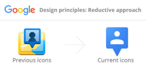
Google Flat Design1. Flat Design
With many brands adopting flat design in the last few years, patients are more aware that less is more when it comes to design. This trend uses simple illustration, clean typography and a lot of white or negative space.

Google is a perfect example. They have redesigned and modernized not only their logo but also their overall identity towards simplistic, flat design. This has allowed them to adapt to a multi-device driven society.

Eyemax Infographic2. Infographics
Infographics have been a major trend in many marketing channels: social media, SEO, content marketing and even print. An infographic can easily present an overwhelming amount of information to your patients in an easy to understand diagram.

Everyone enjoys a well-designed infographic, and above all we love the results… infographics are shared 3 times more than any other piece of visual content.

3. Professional Photography
Many practices are moving away from overused stock photography and making the investment to hire professionals to create custom made imagery.

The overuse of stock images can become unoriginal to include in our branding efforts for a practice. With following this trend, we advise a healthy mix of both for our clients. Custom made imagery is a way for a practice to stand out visually, and be remembered. Stock imagery can be beneficial in visual storytelling with supporting an overall brand message.

As always keep in mind – a picture is worth a thousand words.

Tax Return Marketing

By | Consulting, Marketing | No Comments

Tax day is quickly approaching, so put the FUN back in tax ReFUNd and create some exciting offers for patient’s looking to spend that hard earned cash. Here are a few ideas for offers you can use for your business.

Use The Number “15”

Since tax day is on April 15th, you can give 15% off to either everyone or just to an exclusive few through email or your social media channels. Another idea is to use both the numbers “4” and “15” in your offer, so if you sell something near the $5 or $500 price point you could discount it to $4.15 or $415.

Use Tax Form Numbers

Bruegger’s Bagels is once again giving guests its annual Tax Day break on its Big Bagel Bundles. April 11-15, Big Bagel Bundles are just $10.40 – about a $3.50 “deduction” – for guests who are members of Bruegger’s Bagels’ email club. By incorporating any promotion, with well-known tax terminology, you immediately can become memorable.

 “Use Your Refund”

Encourage your early-bird filers to use their refunds on an investment they can see everyday! By simply reminding them of the opportunity and value of spending this refund with you, you can remain top of mind throughout the entire tax season.