Category

Graphic Design

Finding Inspiration

Finding Inspiration

By | Graphic Design, Marketing, Web Design | No Comments

Let’s be honest….there are days when your creative juices are overflowing and you have a hundred great, new ideas, just bursting at the seams. Then there are other days, where you feel like you are wandering around a desert, hoping for just one idea to come along. During those dark and idealess days, I try and find inspiration to help spark something. There are thousands of different websites to get inspiration, these just happen to be my favorite places to go.

1. Google

This one might seem a little obvious, but whenever I need new ideas I start with Google. Now, google has a much more “business” approach to finding things. It doesn’t always give me great new marketing or design ideas, but it does show me what a lot of other brands are doing. It’s always a good idea to have a base line to start off from. Plus, searching on Google helps me to make sure that my product or design stands out among the rest of them.

2. Behance or Designspiration

The next place I like to search, is Behance or Designspiration. It is in the exact opposite direction of Google (which gives a more of a logical approach), and goes to the extreme artistic side of things. Most of the projects you will find on these sites are not campaigns or marketing materials. They are however, great places to check out different trends going on in the artistic world. This can help you figure out what direction you may want to take a project. I find myself seeing things done in ways I might not have thought. Seeing certain elements or textures that I really like, can give me inspiration to pull from.

3. The Design Blog

Another place I enjoy getting inspiration is from design blogs. One of my favorite blogs is The Design Blog. This is a great place to really focus in more on what you are specifically looking for, such as branding, advertising, print design and many more examples. You can also find a lot of freebies on blogs like this one, that might save you some time in the future.

4. How, Print & Communication Arts Magazines

A great place to get inspiration, especially if you are working on printed materials is by flipping through magazines. Things really are designed differently when they are printed, opposed to just seeing them online. It creates a different feel for the consumer. Personally, I love seeing what sort of ads a magazine has, how an article is laid out in a unique way and what kind of images are used. You can really find inspiration from any magazine, but my favorites are HOW, PRINT and Communication Arts.

5. Pinterest

My favorite place to go when I need inspiration is on Pinterest. I have come across so many people who have never thought to use Pinterest for marketing inspiration. They think it’s only great for DYI projects, but the truth is that they have some great marketing and design inspo. So many people pin items from their portfolios, or interesting facts and infographics they find. It’s a great place to see what types of things are trending and hopefully stir up some creativity.

There are so many different websites that are used to get inspired; share some of your favorite places with us!

Print Techniques

Not All Printing Is The Same

By | Graphic Design | No Comments

Understanding Your Options

There are a wide variety of printing options available. Most printing techniques were developed for very specific applications. The main printing processes we frequently use are Offset, Digital and Screen printing.

Offset Printing is the most common printing process today. It offsets ink from metal plates to a rubber blanket and onto the paper. Almost all commercial printers do offset printing. This method is the most dependable for superior image quality. You receive the most value, as it is the least expensive technique for creating top quality work in large volumes.

Digital Printing is the newest printing process. This method includes Inkjet (use of print heads that spray ink) or xerography (uses electrical charges that attract toner particles) to create prints. Digital printing is best for short-run and fast turnaround work. With this method you are very limited in color, paper choices and quality. However, due to its rising popularity, this technology is fast rising.

Screen Printing is also known as silk-screening. Ink is transferred onto a substrate following a stencil pattern. One shade of ink is printed at a time. Several screens are used to create multicolored graphics. This method is best suited for clothing, stickers and billboards.

Finishing Touches

There are also some really amazing finishing techniques available that can add more visual interest to printed work. We most commonly use Embossing, Varnish, Die Cuts and Foils.

PrintFinishesVarnish is a liquid coating applied to a printed surface to add a clear glossy, matte, satin, or neutral finish.
Embossing
creates a raised impression on a surface.
Die Cuts involve cutting of shapes in paper or paperboard using a die.
Foils are affixed to a certain material by a heating process.

Choosing the Right Printing Techniques

It’s very important that both printing supplier and consumer know the answer to these 6 questions in order to choose the proper method for any given project:

  1. How many print copies are needed?
  2. When is the deadline?
  3. What must be printed and why?
  4. What additional finishes must be completed after the printing?
  5. Which printing tools are available?
  6. Which method can meet the project’s budget?

So when you’re looking for a printer, make sure you know that they can deliver what you need. Printing is a complicated process. The more you ask, the better your printed results will be!

Design Plays a Part in Marketing Efforts

By | Graphic Design, Marketing | No Comments

It is easy to observe that graphic design plays a large role in a practice’s marketing efforts. Strong design is pivotal in gaining traction with any campaign, and should not be overlooked. A strong marketing campaign can easily fall flat with poor or confusing design, so it is important to understand how design contributes to your marketing efforts.

Marketing campaigns are about raising awareness of a brand, product, or service. Campaigns are set up to move consumers to purchase. Consumers buy based on the trust they have with a business, and if a business demonstrates poor design it can compromise that trust. Every piece of creative material a practice releases contributes to its overall brand. A strongly designed campaign can alter a practice’s market position, and help them move beyond competitors.

Great design leads to recognition; it increases visibility and stands apart from the rest. A campaign will only get traction if it is unique, inspired and centered to appeal to it’s target market. It is important to align your campaign with its intended audience; and design is the main vehicle to do so. Don’t fall into the idea that campaigns should be designed to resemble what other practices are doing. The most successful design work creates trends rather then following them.

Design plays an important part in messaging. Great design reinforces a central message for a campaign. A message can be portrayed with carefully selected photography or visual representations. Visual representations can play a major part in emotional reaction. Design elements read much faster to instill a message than reading ever will.

Strong design delivers conversions. A strong marketing campaign should never overlook the call to action technique. Call to actions are simple ways to convert strangers to leads, and can work wonders in measuring a practice’s ROI, while collecting useful consumer information.

There are many ways that design contributes to your marketing efforts. The main point a practice should remember is, all marketing efforts should set their business apart and instill trust in a potential patient.

Collaboration = Success

By | Consulting, Graphic Design, Marketing, Web Design | No Comments

Why is collaboration important to a practice?
We are sure you want to feel like you make meaningful contributions to your practice. At some point we have all had the experience in our career of receiving a sketch/outline/”napkin” and asked to make it look good. It’s important for a practice to collaborate so that a project, whether internal or external will be the best solution.

“Napkins, by my definition, are prototypes in themselves: a skipping to the end that leaves us out, the end of the conversation.” – Aubrey Crane, Partner at Design Map

There are several ways to approach how to handle a response to a napkin as well as how to allow more contributions from your colleagues. All very different techniques, but all reaching for the same thing… better solutions. A team will always create top-quality work, when all members feel equally important.

For Eyemax, design is much more than just putting a nice photo into a brochure or crafting content for a website. Our design process includes everything from defining patient/practice needs, concepting to prototyping and testing to implementing. As a company Eyemax upholds the idea of “collaboration is key for success,” which allows us to create better solutions for our clients.

3 Design Trends for 2016

By | Graphic Design, Marketing | No Comments

Why are design trends important to a practice?
We are sure you don’t want to look and feel outdated. People will make a lot of assumptions based on the impression they get from the design of your website, brochure, or even your television commercial. It’s important for a practice to stand out visually, and staying ahead or on top of trends will allow them to do so.

Eyemax pays close attention to the ever-changing trends of design, on and offline. We’d like to share with you what we believe will be the most prominent trends of graphic design in 2016.

Google Flat Design1. Flat Design
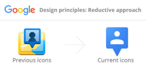
With many brands adopting flat design in the last few years, patients are more aware that less is more when it comes to design. This trend uses simple illustration, clean typography and a lot of white or negative space.

Google is a perfect example. They have redesigned and modernized not only their logo but also their overall identity towards simplistic, flat design. This has allowed them to adapt to a multi-device driven society.

Eyemax Infographic2. Infographics
Infographics have been a major trend in many marketing channels: social media, SEO, content marketing and even print. An infographic can easily present an overwhelming amount of information to your patients in an easy to understand diagram.

Everyone enjoys a well-designed infographic, and above all we love the results… infographics are shared 3 times more than any other piece of visual content.

3. Professional Photography
Many practices are moving away from overused stock photography and making the investment to hire professionals to create custom made imagery.

The overuse of stock images can become unoriginal to include in our branding efforts for a practice. With following this trend, we advise a healthy mix of both for our clients. Custom made imagery is a way for a practice to stand out visually, and be remembered. Stock imagery can be beneficial in visual storytelling with supporting an overall brand message.

As always keep in mind – a picture is worth a thousand words.